Buttons are small. But they control big decisions.
On a landing page, a single button can decide whether someone books a call, downloads a guide, or leaves your site forever. That’s why modern websites don’t use boring flat buttons anymore. They use motion. Depth. Micro-interactions.
In this detailed guide, you’ll learn how to create a premium expanding on hover circle button in Elementor — the same style used by modern SaaS brands and creative agencies.
No extra plugins.
No JavaScript.
Just clean CSS inside Elementor.
Let’s build something that actually feels high-end.
Why This Button Style Works
Before we build it, let’s understand why this type of button performs well.
This design works because it combines:
- Motion (hover animation)
- Visual contrast
- Directional movement (icon slide)
- Shape transformation
- Smooth easing curves
Psychologically, movement draws attention. A circle expanding into a full button creates curiosity. The sliding icon suggests forward motion — which subconsciously encourages clicks.
This is micro-interaction design. And when done right, it increases engagement.
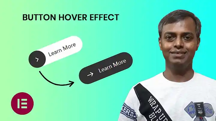
What We Are Building
Here’s what the button will do:
- Starts with a circular color shape on the left
- Text sits to the right
- On hover:
- The circle expands to full width
- Text color changes
- The selected Elementor icon slides slightly to the right
- Everything animates smoothly
It looks minimal, but it feels expensive.
Requirements for Expand on Hover, Circle Button in Elementor
You’ll need:
- WordPress
- Elementor (Free or Pro)
- Basic CSS knowledge (don’t worry — I’ll explain everything)
- A custom CSS field (available in Elementor Pro OR via Advanced → Custom CSS in container/section if enabled)
If you don’t have Elementor Pro, you can add the CSS inside:
Appearance → Customize → Additional CSS
Step 1: Add the Button in Elementor
- Open your page in Elementor.
- Drag the Button widget.
- Set your text (example: “Get Started”).
- Choose any icon (Chevron, Arrow, Custom SVG — your choice).
- Set icon position to “After” (recommended for this style).
Do not style it heavily yet. Keep it clean.
Now we’ll transform it using CSS.
Step 2: Add the CSS Class
Click the Button → Advanced → CSS Classes
Add:
expanding-btn
This gives us a clean target instead of using selector.
Step 3: Add the Final CSS
Now paste this into your Custom CSS area:
.expanding-btn {
    --btn-color:#00FF4A;
    --arrow-color:#ffffff;
    --btn-size:50px;
}.expanding-btn .elementor-button{
    position:relative;
    outline:none;
    border:0;
    vertical-align:middle;
    text-decoration:none;
    background:transparent;
    box-shadow:none;
    padding:0 calc(var(--btn-size) / 2.5);
    overflow:hidden;
}.expanding-btn .elementor-button-content-wrapper{
    height:var(--btn-size);
    align-items:center;
}.expanding-btn .elementor-button-content-wrapper:before{
    content:"";
    position:absolute;
    width:var(--btn-size);
    height:var(--btn-size);
    background:var(--btn-color);
    left:0;
    top:0;
    border-radius:50px;
    transition:all 0.45s cubic-bezier(0.65,0,0.076,1);
}.expanding-btn .elementor-button-text{
    font-size:calc(var(--btn-size) / 3);
    padding-left:calc(var(--btn-size) - 10px);
    position:relative;
    z-index:1;
    transition:all 0.45s cubic-bezier(0.65,0,0.076,1);
}.expanding-btn .elementor-button-icon{
    position:relative;
    left:0;
    z-index:1;
    transition:all 0.45s cubic-bezier(0.65,0,0.076,1);
}.expanding-btn .elementor-button-icon i,
.expanding-btn .elementor-button-icon svg{
    color:var(--arrow-color);
    fill:var(--arrow-color);
    transition:all 0.45s cubic-bezier(0.65,0,0.076,1);
}.expanding-btn .elementor-button:hover .elementor-button-content-wrapper:before{
    width:100%;
}.expanding-btn .elementor-button:hover .elementor-button-text{
    color:var(--arrow-color);
}.expanding-btn .elementor-button:hover .elementor-button-icon{
    left:8px;
}
Save.
Now hover your button.
You’ll see the transformation.
Understanding How This Works
Let’s break it down in simple terms.
1. CSS Variables
--btn-color
--arrow-color
--btn-size
These control:
- Circle color
- Icon color
- Button height
You can change them in one place without editing the whole code.
That’s clean development.
2. The Expanding Circle Trick
This part creates the animation:
.elementor-button-content-wrapper:before
We create a pseudo element that:
- Starts as a small circle
- On hover → width becomes 100%
- Smooth transition animates it
It’s not resizing the button.
It’s expanding a background layer.
That’s why it feels smooth.
3. Smooth Motion Curve
This line is important:
cubic-bezier(0.65,0,0.076,1)
This easing creates:
- Fast start
- Slow finish
- Premium feel
Linear animation feels cheap.
Bezier feels modern.
4. Real Icon Animation
Instead of creating a fake arrow using :after, we animate:
.elementor-button-icon
That means:
- You can use any Elementor icon
- Font Awesome works
- SVG works
- Custom uploads work
This makes it flexible for real projects.
Customizing the Button
Now let’s improve it.
Change Button Color
Edit:
--btn-color:#00FF4A;
You can use:
- Brand green
- Black for minimal style
- Gradient (advanced version below)
Make It Bigger
Increase:
--btn-size:60px;
Everything scales automatically.
Make It Smaller
Reduce:
--btn-size:40px;
Perfect for navbar buttons.
Advanced Version: Add Gradient Background
Replace this:
background:var(--btn-color);
With:
background:linear-gradient(135deg,#00FF4A,#00C853);
Now it looks SaaS-ready.
Advanced Version: Add Glow Effect
Add this under hover:
box-shadow:0 10px 30px rgba(0,255,74,0.4);
Modern. High-converting. Clean.
Common Mistakes to Avoid
1. Forgetting Overflow Hidden
If overflow isn’t hidden, animation breaks.
We already added:
overflow:hidden;
Never remove it.
2. Styling Background in Elementor
Do NOT add background color inside Elementor settings.
It conflicts with the animation.
Keep Elementor button background transparent.
3. Wrong Icon Position
Best practice:
Icon → After
It feels directional (forward movement).
Where to Use This Button
This style works best for:
- Hero sections
- Call-to-action blocks
- Pricing tables
- Portfolio pages
- Agency websites
- SaaS landing pages
Avoid using it for:
- Small footer links
- Minimal text-only buttons
- Dense UI areas
Micro-interactions need breathing space.
Performance Impact
Good news.
This button:
- Uses pure CSS
- No JavaScript
- No extra plugins
- No heavy animations
That means:
- Lightweight
- Fast
- SEO-friendly
- Mobile safe
It’s clean front-end work.
Mobile Optimization
Hover doesn’t work the same on mobile.
But here’s the good part:
The button still looks good without hover.
If you want a mobile effect, you can force full width on smaller screens:
@media (max-width:767px){
.expanding-btn .elementor-button-content-wrapper:before{
    width:100%;
}
}
Now mobile users see the expanded version.
Why Micro-Interactions Matter in 2026
Web design is no longer about static pages.
It’s about:
- Motion
- Feedback
- Feel
Big brands use subtle interaction to guide users.
Look at modern SaaS websites
Look at agency portfolios.
Look at startup landing pages.
They all use motion.
Not too much.
Not distracting.
Just enough.
This button achieves that balance.
Turning This Into a Reusable Asset
If you build websites for clients:
- Save the button as a Global Widget.
- Export the section.
- Keep a reusable CSS library.
- Build your own “Button Style System”.
That’s how you scale design.
Final Thoughts
Anyone can drag a button into Elementor.
But not everyone can make it feel premium.
This expanding circle button:
- Adds personality
- Improves engagement
- Feels modern
- Works on any Elementor site
- Uses real selected icons
- Requires zero plugins
Clean design wins.
Micro details matter.
And when your buttons feel better — your whole website feels better.